mission

how to...


interactive
case study map


glossary

links

help

about

gdc / blog

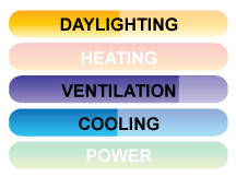
The icon for each category also describes how well the design strategy works. For instance, in the example on the right, by looking at the icon, you could say that the strategy is about 50% good at daylighting; not useful for heating; about 75% good at ventilation; about 50% good at cooling; and not useful for power. Each design strategy varies in its effectiveness and therefore, the symbols will change in appearance to reflect this.
 
Finally, symbols are also provided with each design strategy to indicate roughly how easy it would be to construct on your own (hammers), and approximately how much the project would cost (dollar signs).
That's it! That's all you need to know. You're ready to "green your home". Click the link and follow the instructions on screen from there.

home Like the site? Please take this survey!
greendesigncollective.org © copyright 2009 :: Green Web Hosting! This site hosted by DreamHost. :: thank you for visiting!